Colour theory for fashion designers
Hue, value and chroma, colour harmonies and how to build a balanced seasonal palette.

Photo: cottonbro studio / Pexels · Pexels License (https://www.pexels.com/license/)
Colour theory gives designers a shared language and a method for building palettes that work together across a collection.
Hue, value, chroma
- Hue: the colour family: red, blue, green.
- Value: how light or dark it is.
- Chroma (saturation): how intense or muted it is.
Most palette problems come from value and chroma, not hue: two colours of the same intensity can fight, while a muted partner lets a bright colour lead.
Harmonies that work
- Tonal: one hue in several values: calm and luxurious.
- Analogous: neighbours on the colour wheel: easy and natural.
- Complementary: opposites, used in unequal amounts: energetic.
- Neutral plus accent: a neutral base with one bright: commercial and safe.
Building a season palette
Most balanced palettes have three to four core colours that sell in volume, two or three fashion colours that create excitement, and one or two neutrals that tie everything together.
Temperature and light
Colours are often described as warm (reds, oranges, yellows) or cool (blues, greens, violets), but every hue can lean either way: a blue-red feels cooler than an orange-red. Light changes colour too. Daylight, warm indoor light and store LED lighting can make the same fabric look different, so palettes should be checked under the lighting customers will see.
Colour and fabric
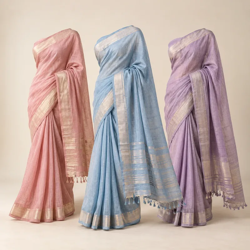
Fabric texture changes how a colour reads. A colour on satin looks brighter and darker in the folds; the same colour on linen looks softer and lighter. Knits absorb light and look deeper. When you build a palette, view it on the actual fabrics of the collection.
Proportion
The amount of each colour matters as much as the choice. A common approach is to use a dominant colour in about 60% of an outfit or display, a secondary colour in about 30% and an accent in about 10%. This keeps outfits balanced and makes it easier for customers to combine pieces.
Colour across regions
- Hot, bright climates: strong sunlight supports saturated colour and white.
- Northern climates: softer, muted palettes often read better in grey daylight.
- Cultural meaning: colours carry different associations; white is linked with weddings in some cultures and mourning in others. Check meanings for each market.
Practical exercise
Take one season palette and create three outfits: a tonal look, a neutral-plus-accent look and a complementary look. Photograph them together. The exercise shows quickly which colours carry the collection and which need a supporting role.
Common questions
What is the difference between hue and chroma? Hue is the colour family; chroma is how intense or muted the colour is.
How many colours should a collection have? Many collections use six to ten colours, split between core, fashion and neutral roles.
Why do two colours clash? Usually because they have similar intensity and compete; muting one often solves it.